Advanced Layouts
Every collection view relys on a CollectionViewLayout object to provide the information. This allows a layout object to reason about the desired layout in whatever way is most appropriate for its goal. Every layout is a subclass of CollectionViewLayout, an abstract class that provides the framework for collection view to access information it needs to display each item correctly.
A few layouts are provided and allow for customization. We’ll go through each of these layouts and some of the tips and tricks of each then discuss building your own layout.
CollectionViewListLayout
CollectionViewListLayout is a simple vertical list similar to an NSTableView/UITableView.
Some of the key customization tips for this layout are the interitemSpacing and sectionInsets. Also available via CollectionViewDelegateListLayout methods for per section values, these properties can turn an ordinary list into a card style list with minimal effort.
CollectionViewColumnLayout
CollectionViewColumnLayout organizes items in each section into columns creating a grid or a pintrest style waterfall depending on your setup.
Coumns and Width
Your first choice is how many columns should be used in a given section. This number in conjunction with column spacing and section insets will determin the width of each item. In the example below our collection view is 800pt wide, with insets of 10 and column spacing of 10 wit 5 columns. This leaves 88pts for each cell, remember at this stage we are only worried about width.

Columns are always equal width and adjusting the spacing, insets, or number of columns will affect the width of each column equally.
Item Height
With the itemWidth set by the column, you have 3 options to set the height of each item. The first option to return a value is used meaning if aspectRatioForItemAtIndexPath is implemented it is used, otherwise, it checks the next one.
aspectRatioForItemAtIndexPath(delegate): Set the height as a ration of the width. For example height = 1:2 * calculatedWidth. value of 0 is ignoredheightForItemAtIndexPath(delegate): Set the height to an exact value.layout.defaultItemHeight: A default height to use if the delegate does not supply a value
A special case also exists if both a ratio and a height are returned by the delegate. in this case a height will be calculated by the ratio and added to the static height from heightForItemAtIndexPath. Considering the example above with a item width of 88 the following examples are valid where ratio and height represent the values returned by the associated delegate method:
ratio = 1:2 (44)
height = 0
itemHeight =  44

ratio = 0:0 (0)
height = 50
itemHeight = 50

ratio = 1:2 (44)
height = 20
itemHeight = 64
When heights are consistent for each item, the items will display in a grif formation. When items vay in height they will take on a waterfall appearance, each item pinning to the previous item in the column. By default items are placed in columns from left to right. This is controlled by the itemRenderDirection and can be set to rightToLeft or shortestFirst.
CollectionViewFlowLayout
A variation of UICollectionViewFlowLayout. This layout is primarily row based, but uses ItemStyles to group similar items together.
#### Styles
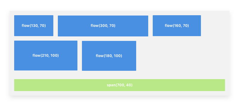
Flow layout uses styles to group items. The layout’s delegate, CollectionViewDelegateFlowLayout, is responsible for providing a style for each item in the collection view. The styles are similar but can be used to create or break groupings based on size.
Flow items are grouped together, always placing as many same height items in each row as possible. If the row becomes full or an flow item of a different height is provided, the layout will just to the next row and continue.
Span items are always placed an their own row and fill the width of the Collection View.
Here you can see an example of how the firt two rows are created by grouping items with the same height. If the third item in the first row had a height of 80, it would have been moved to its own row. New rows will be created when either there is no room left for the next item, the item has a different height than the preceeding ite, or the item is a span.

Transformations
By default items are presented at the given size and left aligned. Transformations allow you to adjust the content of each row before moving on to the next row.
The center transformation will shift the contents in a row to be center aligned without changing the size of any items.
The fill tranformation will enlarge the items in a row proportionally to fill the row. If the items have already filled the row, no tranformation occurs. Note that this change the size of the items from the size provide by the items style and will affect the height of the entire row.
Spacing
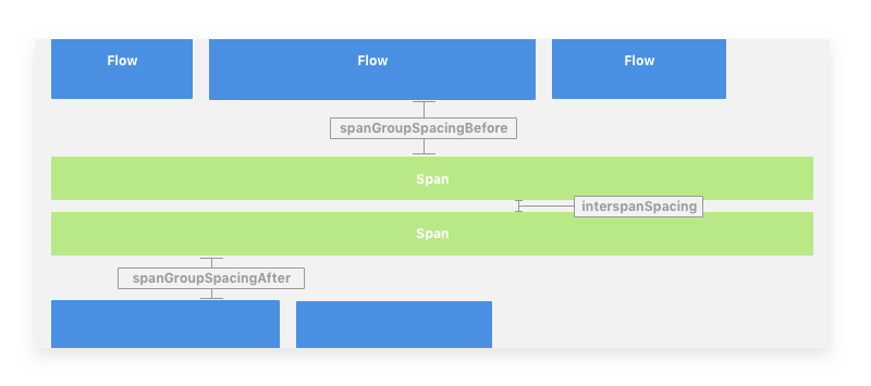
Spacing options such as interspanSpacing and spanGroupSpacingBefore allow you to customize the space around different types of style groups.
The spanGroupSpacingBefore/After options will apply a set amount of space before or after a group of span items (one or more spans).

Custom Layouts
Layouts are designed to make just about arrangment of a collection views contents possible. Creating a new layout requires subclassing CollectionViewLayout and overriding its methods to be able to return the necessary data to the collection view when requested.
That said, it is important to prepare and deliver this data as efficiently as possible. The collection view relies on the layout to determine the location of items and what items exist at particular locations and requests this data often. Doing too much work to detmine this data can lead to slow performance while interacting with the collection view, including scrolling.
The first step in avoiding redundant calculations in a layout is to prepare as much as possible up front. The prepare method should be overriden to do this work. Typically this involved calculation item attributes and caching them for quick reference when requested by the collection view.
For more in depth details about creating a collection see the CollectionViewLayout documentation and refer to the provided layouts.

